Writing is language made visible. Or is it? I have always been fascinated by braille. The video below describes well how blind people write in braille, but this project for me really highlights what the mediating powers of our writing tools really are. Interaction designer Philip Meyer attempted to create a comic book for the blind. He argues: “Most of the tactile material that is available for blind people is very information dense. It’s always about information and not often about art.”
99% invisible (very suiting podcast name for this post) recently made a few mini-stories, including one on the Snellenchart. The Snellenchart, named after dutch ophthalmologist Herman Snellen is one we all know well. The vision chart consists of a pyramid of letters that become smaller and smaller. While it has become quite iconic, it is not the best vision chart available. Every line has a different amount of letters on it, which 99% invisible producer Avery Truffelman describes as its biggest flaw: “it’s basically a different test every time, you have different odds”. In one line it might be OK to get three wrong, in another it might be OK to get four wrong, and this directly translates into the assessment of your vision. There are more precise vision charts out there. Dr. Ian Baley describes his more precise redesign of the chart as “changing markings along the ruler to the same size”. In his redesign he sets straight the Snellenchart’s obvious flaw, but also pays explicit attention to other design decisions such as, which letters should be on the chart? Which letters are more easily confused with others? Which letters create associations?
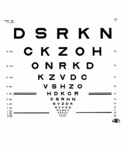
However, the chart is a lot bigger, which does not fit all offices. And, as there are more letters, it is more challenging for doctors to memorise the letters, which is one of the biggest reasons for its popularity: all doctors interviewed in the 99% invisible episode without any trouble recite the Snellenchart (yet they all also admit that it is only an OK tool). So what really makes a design good? The precise, good tool or the less precise, easier to remember, iconic chart that we are all familiar with?
Leave me a Comment