Programming, or writing code, may seem not so closely related to “art” or “aesthetics”, and chances are that people may never need to or get to see the code behind a computer or mobile application when they’re using it, hence the appearance of the code itself doesn’t seem to matter too much. However, for programmers and programming-related workers, how the code actually looks plays a substantial role-it makes the code easier or harder to read, understand, and modify, and that’s where aesthetics comes in.
To illustrate, from my personal experience as a programmer, there are two aspects I would attend to when I write code: text alignment and text styling.
Just as writing for other purposes, there are actually common practices to follow when programmers arrange their code: spacing, alignment/indentation, and wrappings. While these do not necessarily affect how the codes are compiled and executed, proper text alignment does help regulating thoughts and comprehending when a code is read. In the cases where indentations and new lines actually have program-level meanings like Python and Swift, these text arrangements also help with code layout. To illustrate, no one would be happy to read some code that is displayed like the way it happens in the following picture:
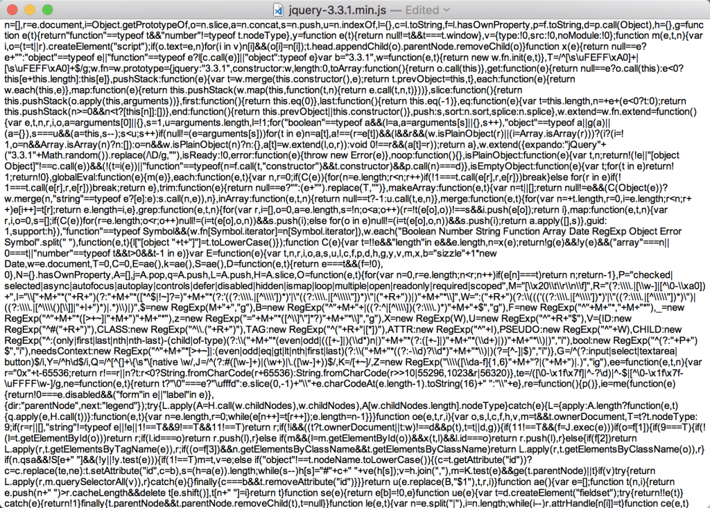
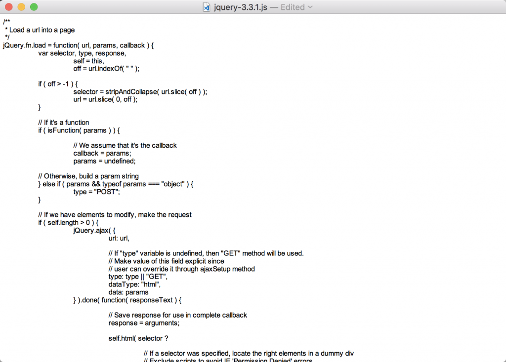
The code in this picture above is written in JavaScript, which is used a lot in websites we visit everyday, and it actually functions for computers to understand it even in the above format(i.e., no spacing or linebreaking), so compressing the texts this way helps speed up the loading of webpages. But such code is completely not readable, and it was probably not originally written this way. When proper indentation and arrangement is implemented, the same code would look much more readable:
Another aspect worthy of my attention is the styling of the code text itself.
On the one hand, mono-spaced fonts are commonly preferred, in which way indentations are identical throughout the code, giving the code a neatly aligned appearance. For example, a chunk of JavaScript code I write would look like this with proper spacing and font (I personally prefer dark background with bright text):
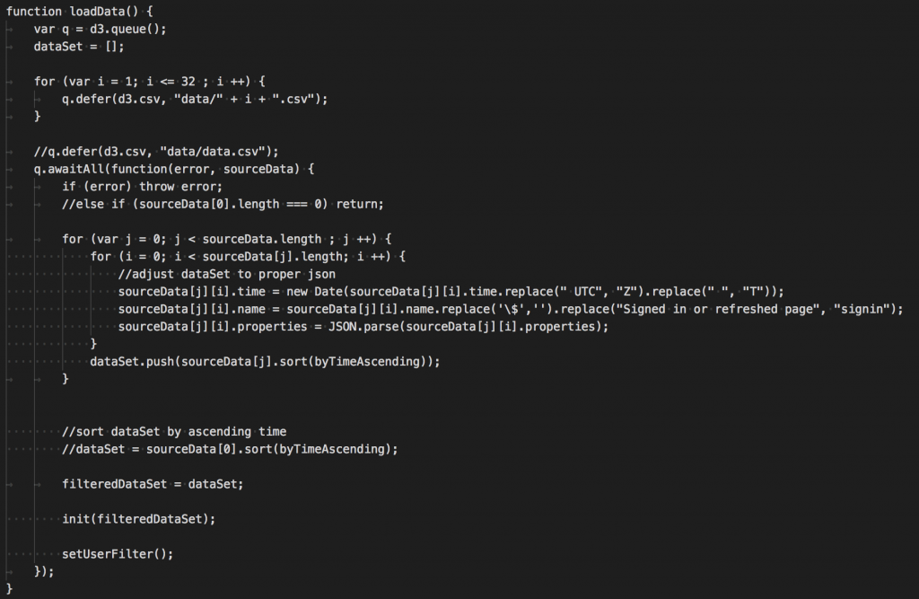
In this way, texts are not squeezed together, and every word with the same number of characters have the same visual length.
On the other hand, different from how people normally writes articles, colours play a decent role in programming. Colouring the code during writing is really helpful, as it differentiates different components (variables, functions/methods, language-reserved words, declarators, comments, etc) inside a program file almost immediately. For instance, a chunk of code with proper colouring may look like this:
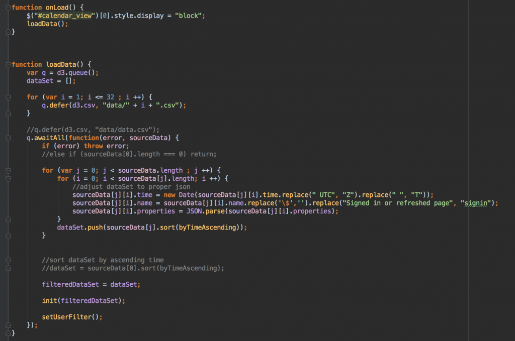
The code above is some JavaScript I wrote in an IDE (Integrated Development Environment) editor, which looks much prettier than how it might have appeared without these colours. Moreover, good colour components helps coloured code stay visually harmonized. I have tried to modify the colour for some of the components when I first used this IDE, such as changing the purples to blues or reds, but it did not end up looking good. It then occurred to me that its default colours implemented harmonized colour component: major colours in use are oranges, purples, and greens, and orange, purple and green are actually a set of triadic colours, meaning a set of three equally spaced colours on a colour wheel:
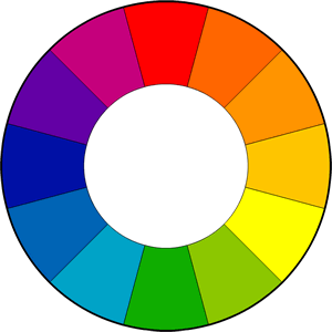
from http://www.tigercolor.com/color-lab/color-theory/color-theory-intro.htm
From colour design theories and our visual experience, we can tell that a set of triadic colours does serve as a basic type of colour composition that satisfies human eyes. It is really interesting to find this amazing correlation between art basics and programming.
Coming back to the topic, as has been shown in the above peek, programming codes can have nice aesthetics when properly styled and formatted, just like how regular articles do. And as it happens, it is amazing how one may discover that something ordinary in their everyday life actually implements concepts across subjects that they might otherwise seldom think about.
Leave me a Comment